
According to Global Digital Report 2019 by We Are Social, Indonesian people recognized as the top 5 countries who spend the most time using the internet, which takes 8hour and 36minutes daily. Further, there are 355.5 million mobile connections or 133% of the total population. The vast majority of that time is spent in apps and on websites.
The difference between a good app and a bad app is usually the quality of its user experience (UX). A good UX is what separates successful apps from unsuccessful ones. Today, mobile users expect a lot from an app: fast loading time, ease of use and delight during interaction. There are many things to consider when designing for mobile. These lists below will also help you in increasing the user experience in using mobile applications.
1. Minimize Cognitive Load
Cognitive load refers to the amount of brainpower required to use the apps. The human brain has a limited amount of processing power, and when an app provides too much information at once, it might overwhelm the user and make them abandon the task. The less friction and confusion users have when interacting with an app, the better the chance that app stays around.
Decluttering
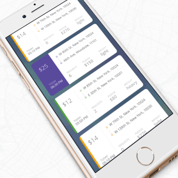
Cutting out the clutter is one of the major recommendations in “Do’s and Don’ts of Mobile UX Design.” Clutter is one of the worst enemies of good design. By cluttering your interface, you overload users with too much information: Every added button, image and icon makes the screen more complicated.
Clutter is terrible on desktop, but it’s far worse on mobile. It’s essential to get rid of anything in a mobile design that isn’t absolutely necessary because reducing clutter will improve comprehension. The technique of functional minimalism can help you deal with the problem of a cluttered UI:
- Keep content to a minimum (present the user with only what they need to know).
- Keep interface elements to a minimum. A simple design will keep the user at ease with the product.
- Use the technique of progressive disclosure to show more options.
It is essential to cut out the clutter to improve comprehension because good UI design is all about delivering relevant information (signal) and avoiding irrelevant information (noise).
Read more : How to Create Design System for User Interface?
Break Tasks Into Bite-sized Chunks
If a task contains a lot of steps and actions required from the user’s side, it’s better to divide such tasks into a number of subtasks. This principle is extremely important in mobile design because you don’t want to create too much complexity for the user at one time. One good example is a step-by-step checkout flow in an e-commerce app, where the designer breaks down a complex checkout task into bite-sized chunks, each requiring user action.
Chunking can also help to connect two different activities (such as browsing and purchasing). When a flow is presented as a number of steps logically connected to each other, the user can more easily proceed through it.
Minimize User Input
Typing on a small mobile screen isn’t the most comfortable experience. In fact, it’s often error-prone. And the most common case of user input is filling out a form. Here are a few practical recommendations to make this process easy:
- Keep forms as short as possible by removing any unnecessary fields. The app should ask for only the bare minimum of information from the user.
- Provide input masks. Field masking is a technique that helps users format inputted text. A mask appears once a user focuses on a field, and it formats the text automatically as the field is being filled out, helping users to focus on the required data and to more easily notice errors.
- Use smart features such as autocomplete. For example, filling out an address field is often the most problematic part of any registration form. Using tools like Place Autocomplete Address Form (which uses both geo-location and address prefilling to provide accurate suggestions based on the user’s exact location) enables users to enter their address with fewer keystrokes than they would have to with a regular input field.
- Dynamically validate field values. It’s frustrating when, after submitting data, you have to go back and correct mistakes. Whenever possible, check field values immediately after entry so that users can correct them right away.
- Customize the keyboard for the type of query. Display a numeric keyboard when asking for phone number, and include the @ button when asking for an email address. Ensure that this feature is implemented consistently throughout the app, rather than only for certain forms.
Use Visual Weight to Convey Importance
The most important element on the screen should have the most visual weight. Adding more weight to an element is possible with font weight, size and color.
Make The Design Consistent
Consistency is a fundamental principle of design. Consistency eliminates confusion. Maintaining an overall consistent appearance throughout an app is essential. Regarding mobile app, consistency means the following:
- Visual consistency:Typefaces, buttons and labels need to be consistent across the app.
- Functional consistency:Interactive elements should work similarly in all parts of your app.
- External consistency: Design should be consistent across multiple products. This way, the user can apply prior knowledge when using another product.
Here are a few practical recommendations on how to make a design consistent:
- Respect platform guidelines.
Each mobile OS has standard guidelines for interface design: Apple’s Human Interface Guidelines and Google’s Material Design Guidelines. When designing for native platforms, follow the OS’ design guidelines for maximum quality. The reason why the following design guidelines is important is simple: Users become familiar with the interaction patterns of each OS, and anything that contradicts the guidelines will create friction.
- Don’t mimic UI elements from other platforms.
As you build your app for Android or iOS, don’t carry over UI elements from other platforms. Icons, functional elements (input fields, checkboxes, switches) and typefaces should have a native feel. Use native components as much as possible, so that people trust your app.
- Keep the mobile app consistent with the website.
This is an example of external consistency. If you have a web service and a mobile app, make sure that both of them share similar characteristics. This will allow users to make frictionless transitions between the mobile app and the mobile web. Inconsistency in design (for example, a different navigation scheme or different color scheme) might cause confusion.
2. Put The User In Control
Keep Interactive Elements Familiar and Predictable
Predictability is a fundamental principle of UX design. When things work in the way users predict, they feel a stronger sense of control. Unlike on desktop, where users can use hover effects to understand whether something is interactive or not, on mobile, users can check interactivity only by tapping on an element. That’s why, with buttons and other interactive elements, it’s essential to think about how the design communicates affordance. How do users understand an element as a button? Form should follow function: The way an object looks tells users how to use it. Visual elements that look like buttons but aren’t clickable will easily confuse users.
The “Back” Button Should Work Properly
An improperly created “back” button can cause a lot of problems for users. Prevent situations when tapping the “back” button in a multi-step process would take users all the way back to the home screen.
A good design makes it easier for users to go back and make corrections. When users know that they can take a second look at data they’ve provided or options they’ve selected, this allows them to proceed with ease.
Meaningful Error Messages
To err is human. Errors occur when people engage with apps. Sometimes, they happen because the user makes a mistake. Sometimes, they happen because the app fails. Whatever the cause, these errors and how they are handled have a huge impact on the UX. Bad error handling paired with useless error messages can fill users with frustration and could be the reason why users abandon your app.
3. Optimize Content For Mobile
Content plays a significant role in design. In most cases, the primary reason why people use an app is the content it provides. But it’s not enough just to have clear, well-crafted content. The content has to be easy to digest.
Make Text Readable and Legible
When we think about content, in most cases we mean typography. As Oliver Reichenstein states in his essay “Web Design Is 95% Typography”: Optimizing typography is optimizing readability, accessibility, usability, overall graphic balance.”
The key to mobile typography is readability and legibility. If users can’t read your content, there’s no point in offering content in the first place.
First, a few practical recommendations on legibility:
- Font size
Generally, anything smaller than 16 pixels (or 11 points) is challenging to read on any screen.
- Font family
Most users prefer a clear, easy-to-read font. A safe bet is the system’s default typeface (Apple iOS uses the San Francisco font; Google Android uses Roboto).
- Contrast
Light-colored text (such as light gray) might look aesthetically appealing, but users will have a hard time reading it, especially against a light background. Make sure there is plenty of contrast between the font and the background for easy readability. The WC3’s web content accessibility guidelines provide contrast ratio recommendations for images and text.
And now, a few recommendations for readability:
- Avoid all caps.
All caps text — meaning text with all letters capitalized — is fine in contexts that don’t involve attentive reading (such as acronyms and logos), but avoid it when your message requires heavy reading.
- Limit the length of text lines.
A good rule of thumb is to use 30 to 40 characters per line for mobile.
- Don’t squeeze lines.
Adding space between text aids the user in reading and creates a feeling that there isn’t so much information to take in.
Read more : A Use Case for Proper Mobile Apps Development
4. Adapt Mobile Design To Emerging Markets
According to Google, a billion new users are expected to come online in the next couple of years. And the vast majority of them will be from emerging markets (or so-called mobile-first countries, like India, Indonesia, Brazil and Nigeria). They will gain access through a mobile phone.
Poor Internet Connectivity
Products in emerging markets have to be able to perform over slow or intermittent connectivity. Depending on a person’s location, the network might switch from Wi-Fi to 3G to 2G to no connectivity at all, and your product has to accommodate that.
If you plan to design for such market, consider the following:
Make sure your product works when it isn’t connected to the Internet at all. Allow caching of data.
Optimize your product for fast loading. Minimize page size by keeping images and other weighty content to a minimum; and reduce the size of that content.
Local Aesthetics
Minimalist design, If you want your product to succeed in emerging markets, pay attention to the cultural aesthetics. You can get inspiration from regionally popular products or hire local designers who are familiar with user preferences. Designing according to local aesthetics will make your product feel more relatable.
5. Helpful Tools And Resources For Designers
Color Contrast Checker
It’s surprising how many mobile apps don’t pass the AA test. Don’t be one of them! It’s essential to check the accessibility of your color contrast. Use WebAIM’s Color Contrast Checker to test color combinations.
A great design is the perfect combination of beauty and functionality, and that is exactly what you should be aiming for when building an app. But don’t try to build a perfect app right on the first attempt. It almost impossible. Instead, treat your app as a continually evolving project, and use data from testing sessions and user feedback to constantly improve the experience.