
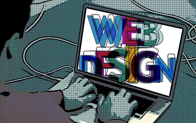
It doesn’t matter what site we’re running – whether it is an e-commerce site for people buying things online from us, a business site explaining our profile and things our business provides, or even a blog consisting of how our daily life goes – it has always been best to think about your users’ experience first. Think about what aspects would make them stay longer and surf deeper in our website, or even better, buy things from us.
The answer to that issue could vary, but one thing that often gets neglected is the aesthetic aspects of our website, one of them is the fonts we’re using. Let’s break it down, sure our contents on the website could involve various texts, images, or videos, but in reality it is texts that are visible to our users 99% of the time.
With that being said, choosing the right font style therefore is essential for our users’ experience. It is not always about fonts that standout and are fabulous. In this case, readability is number one when it comes to users’ experience, which means basic fonts are solid enough.
It is best to go low profile, fonts that are easy to read, yet still giving an outstanding and distinguished impression – we refer to these as basic fonts. With that being said, this is our list of the best basic fonts you should try for your website design.
Mont

We’re starting our list with a pretty popular one, Mont, which is a great choice no matter how you look at it. Its versatility is off the chart for the casual vibes that it gives. Considering how far it is from the word ‘rigid’, Mont would 100% look great in any circumstances and placement.
Coolvetica
Coolvetica does not differ so much from Mont, they both give similar impressions. The thing is, Coolvetica is one step away from being categorized as a formal font, if it’s not for the curve and the accents on some characters. With that being said, Coolvetica is also a casual and versatile font.
Azonix
Next, we have Azonix, a quirky one we must say. The sharp edges, wide angles, and some simplifications to certain characters (incompleted A for instance) are giving the impressions of high spirited and mobility activities. If your site mainly works in the sport industry, this basic font might suit you best.
Qualy

Right off the bat, Qualy is a basic font that will give you a futuristic impression. The main characteristics of this font is rigid-looks with lack of curves and the wide-cutting line in some alphabets. ‘Industrial’ might be the best word to describe this font, and while we’re at that, put some Qualy fonts for industrial related sites.
Minimal

Just like the font’s name, minimal or we should say simplistic is the best description to this font. Thin lines, lots of curves, and wide angles will give you an impression of peace and clarity. This basic font is a versatile one, considering the lack of quirkiness it has, so don’t be afraid to put this into your arsenal.
Arual

Arual is a fine mixture between quirkiness and minimalistic. Thin alphabets and subtle curves represent the minimalistic nature, whereas the incompleteness of certain alphabets (the uppercase A for instance) really bring the quirkiness out of the water. Overall, if you want to convey a simplistic and unique characteristic, this basic font would suit your needs.
Maia

Maia is like the name of a cute little girl, and this Maia font brings the same spirit with it. Cute is a perfect way to describe the impression it gave us. The overwhelming amount of curves on its alphabets are what really set this basic font apart in terms of cuteness. If little kids are your business’ demographic target, be sure to make Maia a part of your website.
Oldstyle

This basic font lives up to its name, it will take you to the early 1900s whereas this kind of fonts are the most popular ones. If you need some vintage touches in your website, do not hesitate to take Oldstyle with you.
Champagne and Limousines

Champagne and Limousines are two things that are highly relevant to the phrase ‘luxurious lifestyles’. So is this basic font, it gives us the impression of elegance with the correct amount and placement of curves in the alphabets, and some unique characters (the ‘&’ for instance).
Chapaza
Chapaza differs from all of the basic fonts above. Being the only one in this list that is considered rigid and formal, this basic font’s features are pretty much normal, not much of a character. Use this basic font if your websites are really on the formal side.