
It is important to apply Gestalt principles when designing UX because an attractive and easy-to-understand design is not enough. Good UX design is when a designer can direct the user’s attention to where the information is right and important.
But before that, do you know what the Gestalt principle is?
The Gestalt principle is a rule to explain how the human eye creates the perception of visual elements. The purpose of the principle is to show how a complex shape or look complicated can be simple and more interesting.
Gestalt comes from German which means form. The emergence of the Gestalt principle originated from the results of observations about human behavior carried out by an Austro-Hungarian-born psychologist named Max Wertheimer, then this principle continues to develop from time to time.
This principle explains that our brain tends to group things together or conclude a form as a whole rather than as small parts.
An object that looks complicated and is formed from many elements and looks random will be arranged by the mind into an orderly system because basically, humans will always try to form order from things that look messy.
From that principle, a UX designer can adapt it into a design that is simple but full of the right functions and is still attractive.
Here are Gestalt principles that you can use to design UX:
Simplicity
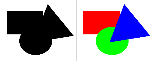
Simplicity is the basic principle of Gestalt. Elements that are simple, clear, and organized can convey messages clearly and without confusion. When faced with complex shapes, the eye tends to rearrange irregular objects into simple components or into simple entities.
For example, you will find it easier to see in the image on the top right, that the object consists of circles, squares, and triangles, than image on the left, which is a complex shape.
Proximity
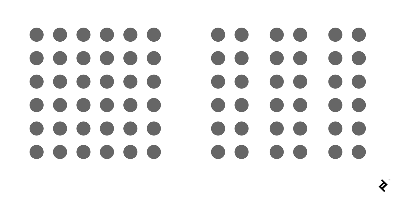
The proximity rule in the Gestalt Principle states that objects that are close to each other will appear more related.
An example of the proximity rule is in the image above.
In this image, elements that are close together appear as a group, while those that are far apart appear separate. In UX design, we often see this, for example in the placement of fields that must be filled.
Common-Region

This law is related to the law of proximity. If objects are in close proximity, the brain automatically perceives them as the same group.
If given a barrier, it will immediately be seen that the group is separated from the others.
In UX design, one of them is used to create cards that group images and text in one area.
Similarity
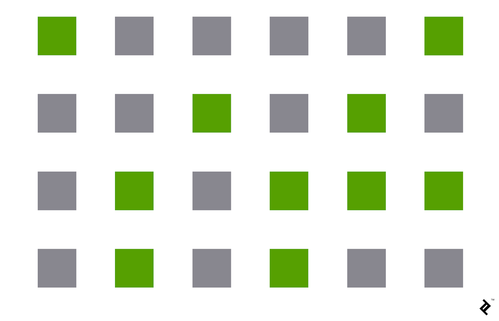
The rule of resemblance Gestalt Principles for UX design is where similar objects are grouped and assume to have the same function.
If they are similar and the color is the same, surely our minds consider them the same group. In UX design, this can usually be seen in links that are a different color from plain text.
We can immediately tell their functions are different because they are not the same color, which is usually blue.
Figure/Ground
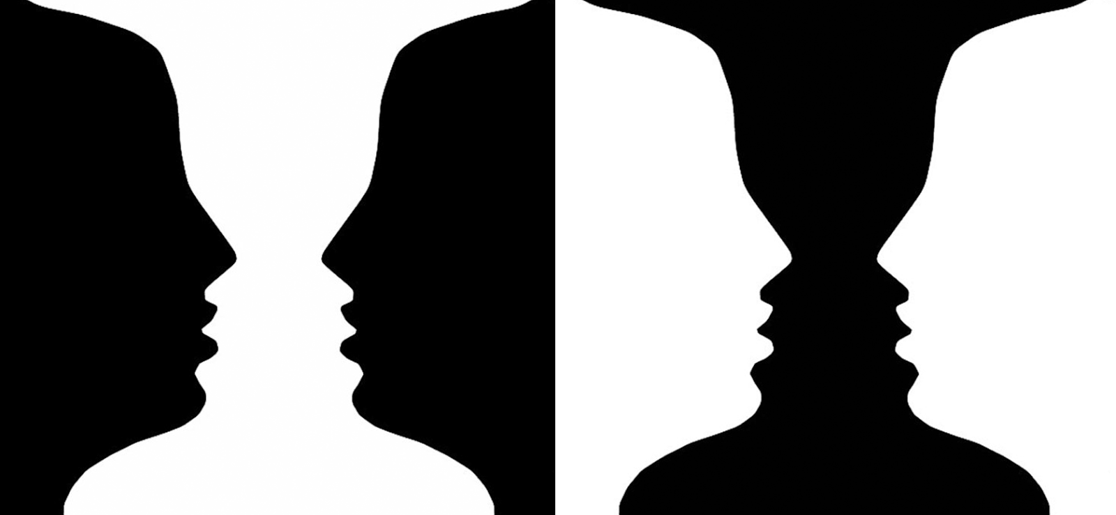
The figure/ground principle in Gestalt states that people subconsciously place an object in front of or as a background.
Usually, your brain will focus on only one of them.
An example is the design above, where we immediately know which is in front and which is behind. We focus only on what stands out.
Closure

When humans see a complex set of visual elements, our brain will try to find a pattern. This is what is called a closure rule in gestalt principles for UX design. You can immediately deduce a shape pattern from the use of negative space in the design.
Continuity

The next Gestalt principle is sustainability, i.e. elements for designs that are designed in straight lines.
You can usually find this in the drop-down menu in the second option for easy navigation.
Focal Points

Anything that stands out will always be the center of attention of anyone who sees it. These rules of Gestalt Principles are used for UX design.
Symmetry
Symmetrical objects give the eye a feeling of balance and harmony. Composition is the main focus of this principle. Simply, put the composition shouldn’t give off a sense of distraction or imbalance, as viewing visitors will waste time.